Resources · 5 min read
Icon Libraries and Design Systems: Free Resources Every Web Designer Should Know
The free icon libraries and design systems professional web designers use, from Lucide and Heroicons to shadcn/ui and Radix, and how to build a focused toolkit.
Share

Key takeaways
- A design system is a shared set of reusable, tested UI components that keeps a website consistent and saves time on every build.
- Lucide, Heroicons, Phosphor, and Material Symbols cover modern icon needs with different styles, counts, and formats.
- shadcn/ui is components you copy into your project and own, built on Radix UI and Tailwind, giving full control plus built-in accessibility.
- Chakra UI and DaisyUI prioritize fast prototyping over pixel-perfect custom design.
- A focused toolkit, one icon library, one component foundation, and a few utility tools, beats collecting overlapping libraries.
A design system is a shared set of reusable, tested UI components, such as buttons, cards, forms, and navigation, that a team assembles instead of building each element from scratch. Paired with a good icon library, it keeps a website visually consistent and saves real time on every build. You spend your effort on the parts that make the project distinct, not on redrawing a checkbox for the hundredth time.
These are the free resources professional web designers actually reach for in 2026, grouped by what they do.
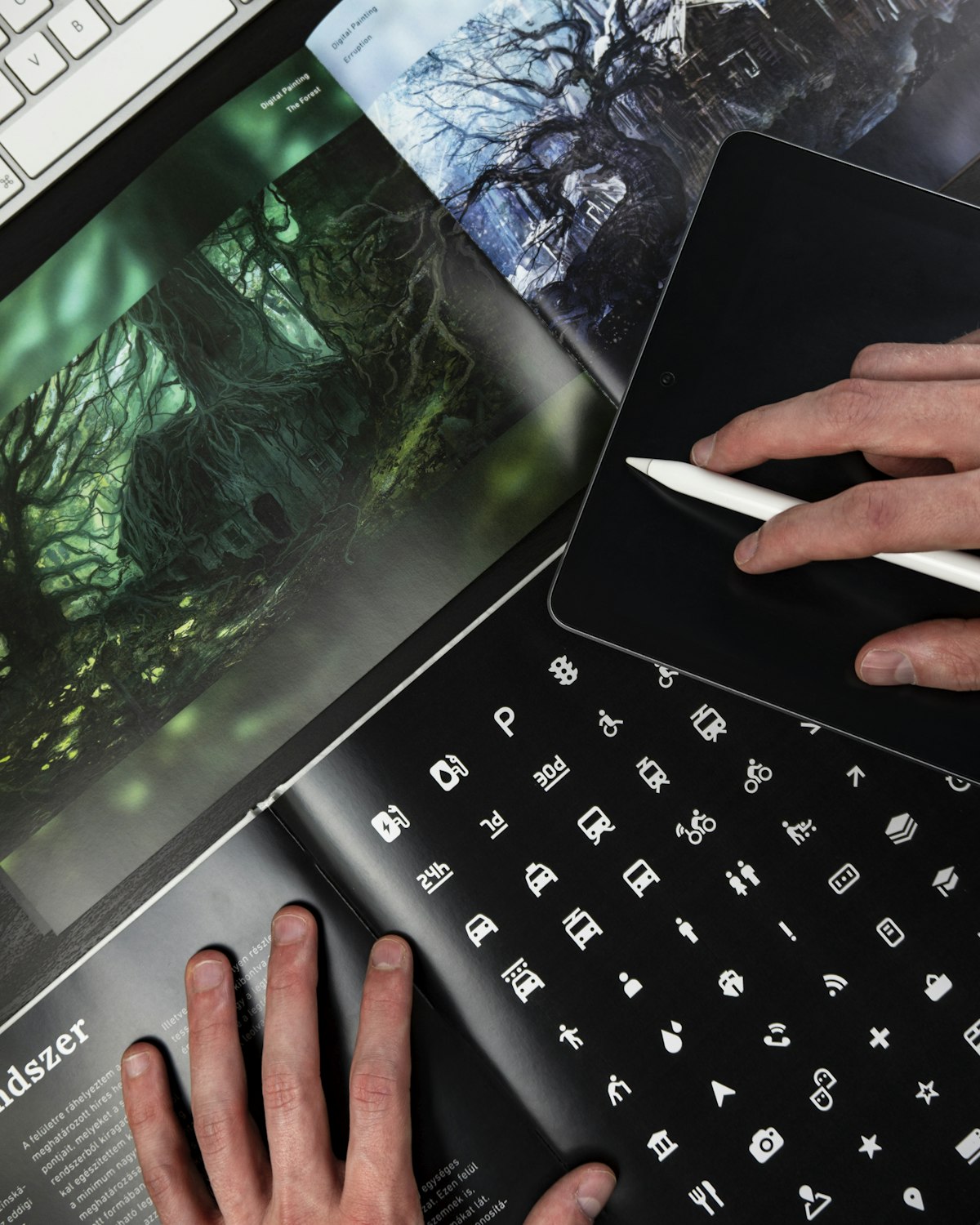
Which free icon libraries are worth using?
The best free icon libraries are Lucide, Heroicons, Phosphor, and Material Symbols, each with a different strength. They all ship clean, scalable SVG icons, so the choice usually comes down to style and how many icons you need.
| Library | Icon count | Style | Best fit |
|---|---|---|---|
| Lucide | 1,000+ | Clean 24x24 outline | General-purpose default for most projects |
| Heroicons | ~290 | Outline, solid, mini | UI work, pairs naturally with Tailwind |
| Phosphor | 6,000+ | Six weights incl. duotone | When you need weight variety for hierarchy |
| Material Symbols | 2,500+ | Variable font | Material Design or dynamic weight/fill needs |
Lucide is a fork of Feather with a much larger set, and it has become the default for modern projects because the icons stay crisp at any size and ship as React, Vue, SVG, and web-font formats. Heroicons comes from the Tailwind CSS team and is tuned for clarity at small UI sizes. Phosphor stands out for its six weights, which is handy when you want icon styling to follow the same hierarchy as your type. Material Symbols is a variable font, so a single file lets you adjust weight, fill, and optical size on the fly.
What is the difference between a component library and a foundation like shadcn/ui?
A traditional component library is an installed dependency you import and style around. shadcn/ui is different: it is a collection of components built on Radix UI and Tailwind CSS that you copy into your project and own outright. Because the code lives in your repo, you can edit anything, and there is no upstream package dictating how your buttons look.
That ownership model is why shadcn/ui has become the de facto foundation for React and Next.js projects. The components are accessible out of the box and unstyled enough to take on any brand. Underneath it sits Radix UI, a set of unstyled, accessible primitives for the tricky interactive patterns, dialogs, dropdowns, tabs, tooltips. Radix handles the behavior and keyboard interaction; you provide the look. For teams that want full design control without rebuilding accessibility from scratch, that split is the whole appeal.
When should you reach for Chakra UI or DaisyUI instead?
Reach for Chakra UI or DaisyUI when speed of prototyping matters more than pixel-perfect custom design. Chakra UI is a fuller React component library with built-in theming, responsive styles, and accessibility. It is more opinionated than Radix, which makes it faster to assemble screens but harder to bend into a fully bespoke look.
DaisyUI takes a different route. It adds semantic class names like btn, card, and navbar on top of Tailwind's utilities, so you write less markup while keeping Tailwind's flexibility. It also ships multiple themes you can swap with a single data attribute. Both are good fits for projects that need to move quickly and do not require a one-of-a-kind interface.
What about color and typography tools?
The supporting tools that round out a design system are mostly about color and type. Coolors generates palettes and checks contrast ratios. Type Scale helps you set a typographic hierarchy with calculated font sizes. For pairing typefaces, our font pairing guide for web design goes deeper on what actually works together. These do not replace a component library; they establish the visual foundation the components are built on.
What is a practical toolkit for a web design studio?
A practical toolkit is one icon library, one component foundation, and a small set of utility tools, not every resource you can find. The goal is consistency, not collection. A typical setup pairs Lucide or Heroicons with shadcn/ui or Radix, then adds Coolors and Type Scale for the visual groundwork.
This kind of focused stack covers nearly everything a professional build needs without the overhead of maintaining several overlapping libraries. It is the same curated approach we use to deliver consistent, high-quality work efficiently across projects. If you would rather hand the build to a team that already has this dialed in, book a call and we will take it from there.
Related service
Web design services in the PhilippinesFrequently asked questions
Why should web designers use icon libraries and design systems?
They save time by providing tested, accessible, consistent components and icons, so designers do not rebuild every button, card, form element, and navigation pattern from scratch on each project.
Which free icon libraries are worth using?
Lucide, Heroicons, Phosphor, and Material Symbols. Lucide is a clean general-purpose default, Heroicons suits Tailwind UI work, Phosphor offers six weights, and Material Symbols is a customizable variable font.
What makes shadcn/ui different from a traditional component library?
shadcn/ui is a collection of components you copy into your project and own, rather than an installed dependency. It is built on Radix UI and Tailwind CSS, and is accessible, customizable, and easy to adapt to a brand.
When should a team use Radix UI?
Use Radix UI when you want full design control but still need reliable accessibility and keyboard interaction for complex patterns like dialogs, tabs, dropdowns, and tooltips. Radix handles behavior; you handle styling.
What is a practical toolkit for a web design studio?
One icon library such as Lucide or Heroicons, one component foundation such as shadcn/ui or Radix, and a few utility tools like Coolors and Type Scale. Consistency matters more than collecting every resource.
Let's build something
great together
Have a project in mind? We'd love to hear about it and explore how we can help bring your vision to life.
Get in touchPillar guideDevelopment · Jan 26
The Modern Web Development Stack: Building for Performance and Scale in 2026
Resources · Apr 25
Web Design Inspiration: Where Top Agencies Find Their Best Ideas in 2026
Development · Apr 24
Glassmorphism and Frosted Glass UI: The Design Aesthetic Defining Modern Websites
Development · Apr 22