Business · 10 min read
5 Signs Your Website Is Outdated (And What It’s Really Costing You)
An outdated website doesn’t just look bad — it actively drives customers to your competitors. Here are 5 clear signs your site needs a redesign, the real revenue impact of ignoring them, and what a modern website should actually look like in 2026.
Share

Key takeaways
- If your site isn't fully mobile-friendly, you lose most visitors before they read a word.
- A load time over 3 seconds tanks both conversions and rankings. Speed is a revenue issue.
- Needing a developer for every small edit means your site is holding your business back.
- A dated design erodes trust instantly. Visitors judge credibility in seconds.
- Traffic without conversions points to a UX problem. An outdated site quietly bleeds revenue every month.
Most businesses don’t realize their website is costing them money until it’s far too late. By the time they notice — declining leads, rising bounce rates, competitors pulling ahead — the damage has been compounding for months, sometimes years.
Here’s the uncomfortable truth: your website isn’t a digital brochure you set and forget. It’s often the very first interaction a potential customer has with your business. And first impressions are ruthless. Studies consistently show that users form an opinion about your site in under a second. If that opinion is “this looks outdated,” they’re gone — straight to a competitor whose site doesn’t feel like it was built during the last presidential administration.
If your website was designed more than three or four years ago and hasn’t had a significant overhaul since, there’s a strong chance it’s actively hurting your business right now. Not in some vague, theoretical way — in real, measurable revenue. Here are the five signs you absolutely cannot afford to ignore.
Sign #1: It’s Not Mobile-Friendly (Or Barely Is)
Let’s start with the most fundamental problem. In 2026, over 60% of all web traffic comes from mobile devices. For some industries — restaurants, local services, e-commerce — that number climbs above 75%. If your website isn’t delivering a genuinely good experience on a phone, you’re alienating the majority of your audience before they even see what you offer.
And no, “it technically works on mobile” doesn’t count. If visitors have to pinch and zoom to read your text, if buttons are too small to tap accurately, if your navigation is a nightmare on a 6-inch screen — that’s not mobile-friendly. That’s desktop with smaller pixels.
Google made this non-negotiable years ago with mobile-first indexing, meaning the search engine primarily uses the mobile version of your site for ranking and indexing. If your mobile experience is poor, your search visibility suffers across the board — even for people searching on desktop.
True responsive design isn’t just about shrinking the desktop layout. It’s about redesigning the experience for how people actually use their phones: thumb-friendly navigation, streamlined content hierarchy, fast-loading assets, and tap targets that don’t require surgical precision. If you’re making common UX mistakes on mobile, those errors are magnified tenfold because the tolerance for friction on a phone is essentially zero.
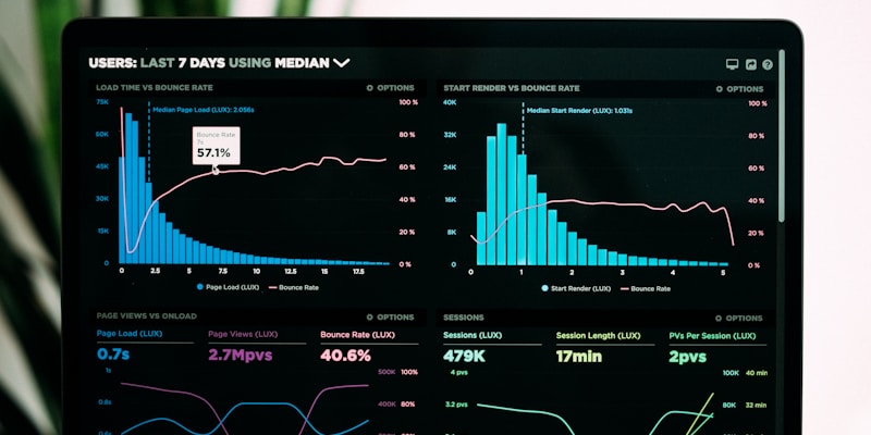
Sign #2: Your Load Time Is Over 3 Seconds
Speed isn’t a nice-to-have. It’s the baseline expectation. 53% of mobile visitors will abandon a site that takes longer than 3 seconds to load. Think about that — more than half of your potential customers are leaving before they see a single word of your content, a single product, a single reason to choose you.
It gets worse. Research from Google and Akamai shows that every additional second of load time reduces conversions by approximately 7%. If your site takes 6 seconds to load instead of 2, you’re not just slower — you’re hemorrhaging leads at a rate that would make any business owner lose sleep if they actually saw the numbers.
The usual culprits behind slow websites are predictable and fixable:
- Unoptimized images — full-resolution photos being served when compressed versions would look identical
- Bloated plugins — years of adding functionality without ever auditing what’s actually running
- Cheap hosting — shared servers that buckle under even moderate traffic
- Render-blocking scripts — JavaScript and CSS that prevent the page from displaying until everything loads
- No caching strategy — forcing the browser to re-download everything on every visit
You can test your site right now with Google’s PageSpeed Insights. If your score is below 70, you have a problem. Below 50, you have an emergency.
Sign #3: You Can’t Update It Without Calling a Developer
Here’s a scenario that’s far too common: you notice a typo on your homepage, or your hours change, or you want to add a new service. Simple updates. The kind of thing that should take five minutes. Instead, it takes five days — because you have to email your developer, wait for them to find time, and then wait again while the change goes through some opaque process you don’t understand.
If making a basic text change requires a support ticket, your content management system is broken. Full stop. A modern website should empower you to make routine updates yourself — changing copy, swapping images, adding blog posts, updating pricing — without touching code or begging for help.
This isn’t just an inconvenience problem. It’s a business problem. When updating your site is painful, updates don’t happen. Outdated information stays live for weeks or months. Your “latest news” section shows a post from 2024. Your team page still lists employees who left last year. Your pricing reflects rates you changed two quarters ago. Every piece of stale content quietly erodes trust with visitors who notice — and they do notice.
The irony is that many businesses end up in this situation because they were told a DIY website builder or a heavily customized theme would give them control. Instead, they got something fragile that only the original developer can safely touch. A properly built site gives you real editorial control without the risk of breaking everything.
Sign #4: Your Design Looks Like It’s from Another Era
Web design trends evolve quickly, and nothing ages a business faster than a website that’s visually stuck in the past. You know the hallmarks: — something the team at Studio Aurora bakes into every project from the ground up.
- Giant image sliders on the homepage that auto-rotate through generic stock photos
- Tiny body text crammed onto oversized hero banners
- Hamburger menus on desktop — hiding your navigation behind three little lines even when there’s plenty of screen space
- Parallax everything — background images that scroll at different speeds for no functional reason
- Gratuitous animations — elements bouncing, fading, and sliding in from every direction
If any of these describe your site, visitors are making a judgment before they read a single word. And that judgment is fast — users assess your site’s visual credibility in just 0.05 seconds. That’s not enough time to appreciate your clever copy or your competitive pricing. That’s enough time to decide whether your business looks legitimate.
This matters more than most people realize. Research from Stanford’s Web Credibility Project found that 75% of users judge a company’s credibility based on its website design. For B2B buyers specifically, website design is the single most influential factor in determining whether a company is trustworthy. Not testimonials. Not case studies. Design.
Modern design in 2026 is defined by restraint: generous whitespace, intentional typography, muted color palettes, and layouts that guide the eye rather than overwhelm it. If you want to understand how design psychology and color choices directly influence whether visitors convert or bounce, it’s worth paying attention to — because your competitors certainly are.
Sign #5: You’re Getting Traffic But No Conversions
This is the most expensive problem on the list, and it’s the one that hides in plain sight. You might even think your website is “working” because Google Analytics shows decent traffic numbers. But traffic without conversions is like a store full of people who never buy anything. You’re paying for visitors — through SEO, ads, content marketing — and then watching them leave empty-handed.
The symptoms are consistent across industries:
- Missing or weak calls-to-action — visitors don’t know what you want them to do next
- Confusing navigation — too many options, unclear labels, dead-end pages
- No social proof — no testimonials, no reviews, no case studies, no trust signals
- Buried contact information — making people hunt for a way to reach you
- Forms that ask for too much — every additional field reduces completion rates
A website redesign that’s focused specifically on conversion — not just aesthetics — can double or triple your lead generation without increasing your traffic by a single visitor. That’s not hyperbole. It’s what happens when you stop treating your website like a brochure and start treating it like your hardest-working salesperson. If your site is quietly losing customers, the traffic numbers are just masking the real problem.
The Real Cost of Keeping an Outdated Website
Let’s make this tangible with a simple hypothetical. Say your website gets 5,000 visitors per month — not unusual for an established small business with some SEO presence. With an outdated site, you’re converting at maybe 1%. That’s 50 leads per month.
Now imagine a modern, conversion-optimized redesign bumps that rate to 3% — a modest, realistic improvement. That’s 150 leads per month. An additional 100 leads, every single month, from the same traffic you’re already getting.

If your average customer is worth $500, that’s $50,000 in additional monthly revenue. Over a year, that’s $600,000 left on the table — not because you didn’t have the traffic, but because your website couldn’t close. And that’s just the direct conversion math. Factor in the compounding losses:
- Lost credibility — prospects who visit once, judge you, and never return
- Lost SEO rankings — Google deprioritizing your slow, non-mobile-friendly site quarter after quarter
- Lost referral impressions — every person who shares your link is sending people to a site that doesn’t represent your actual quality
- Lost talent — job candidates who check your site and decide you’re not a company they want to work for
The hidden costs of an underperforming website extend far beyond what shows up in your analytics dashboard. They’re baked into every missed opportunity you never even knew about.
What a Modern Website Looks Like in 2026
So what should you actually be aiming for? A modern website in 2026 isn’t about flashy effects or trendy gimmicks. It’s defined by substance:
- Performance-first architecture — sub-2-second load times, optimized assets, and infrastructure that scales. Speed is the foundation everything else is built on.
- Clean, intentional design — generous whitespace, purposeful typography, and a visual hierarchy that guides visitors toward action without overwhelming them.
- Conversion-optimized layouts — every page has a job. Every section moves the visitor closer to a decision. Nothing decorative for decoration’s sake.
- Accessibility built in, not bolted on — proper semantic HTML, keyboard navigation, screen reader compatibility, and sufficient color contrast. This isn’t charity — it’s good engineering that improves the experience for everyone.
- Content management that actually works — your team can update copy, publish posts, and manage media without developer intervention.
- SEO as a structural element — clean URLs, proper heading hierarchy, schema markup, and Core Web Vitals scores that keep Google happy.
If you’re curious about the technology stack behind modern websites, the tools have come a long way. But the tools matter less than the strategy — a beautifully built site with no conversion plan is just expensive digital art.
Time to Stop Losing Money
If any of these five signs sound familiar, you already know the answer. The question isn’t whether your website needs attention — it’s how much longer you’re willing to pay the price of pretending it doesn’t.
The cost of doing nothing is always higher than the cost of doing it right. Every month you delay, you’re funding your competitors’ growth with the leads your website is failing to capture. A proper redesign isn’t an expense. It’s the highest-ROI investment most businesses can make — because it multiplies the return on every other dollar you spend on marketing.
Related service
Web design services in the PhilippinesFrequently asked questions
How do I know if my website needs a redesign?
Watch for a poor mobile experience, slow load times, an inability to make edits yourself, a dated look, and traffic that doesn't convert. Any of these signals it's time.
How often should a website be redesigned?
Roughly every 3 to 4 years, or sooner if it's not mobile-friendly, slow, hard to update, or no longer converting visitors into customers.
Does an outdated website really affect sales?
Yes. Slow, dated, or hard-to-use sites increase bounce rates, hurt search rankings, and send potential customers straight to competitors, which is a measurable revenue loss.
What should a modern website look like in 2026?
Fast, mobile-first, easy to update, accessible, and conversion-focused, built on current technology rather than left as a static brochure.
Is a redesign or a full rebuild better for an outdated site?
It depends on the foundation. A refresh works if the structure is sound. A rebuild is better when the site is slow, insecure, or impossible to maintain.
Time for
a redesign?
Let's turn your outdated site into one that works as hard as you do.
Start your redesignPillar guideBusiness · Feb 13
Website Redesign vs. New Build: How to Know Which One You Actually Need
Business · Apr 18
The Website Lifecycle: When to Redesign, Refresh, or Leave It Alone
Resources · Feb 19
How to Plan a Website Redesign Without Losing Your Search Rankings
Business · Feb 16