Business · 10 min read
Website Checkout Optimization: How to Reduce Cart Abandonment and Recover Lost Sales
Most cart abandonment is a checkout problem, not a product one. How to cut friction, add the payment methods Filipino shoppers use, and recover lost sales.
Share

Key takeaways
- Most cart abandonment comes from fixable checkout friction, not from the product itself.
- Hidden shipping, tax, and fee surprises are the top reason shoppers leave before paying.
- Guest checkout, short forms, progress indicators, and trust signals lift completion rates.
- Philippine stores convert better when they offer GCash, Maya, bank transfer, card, and COD.
- Recover lost sales with exit offers, abandoned-cart messages, persistent carts, and retargeting.
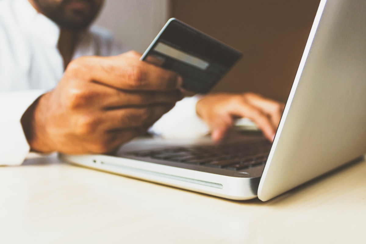
Most cart abandonment is a checkout problem, not a product problem. The shopper already decided they wanted what you sell. Something in the last few screens, an unexpected fee, a forced account, a form that felt endless, talked them out of it. The encouraging part is that nearly all of it is fixable with design and UX changes, not a new product or a bigger ad budget.
This guide breaks down why Philippine shoppers abandon carts, how to design a checkout that converts, and how to recover the sales you would otherwise lose. If you are still scoping the build, our e-commerce website cost guide for the Philippines covers what a properly built store actually costs.
What is cart abandonment?
Cart abandonment is when a shopper adds items to their cart but leaves before completing the purchase. According to Baymard Institute's aggregated research, the average documented online shopping cart abandonment rate is about 70% across industries. That figure reflects global data, so treat it as a benchmark, not your exact number, but the message holds: most stores lose the majority of carts they create, and the checkout flow is usually where it happens.
The reason it matters is leverage. You already paid to acquire that traffic through ads, SEO, or social. Every recovered checkout is a sale you do not have to pay to acquire again.
Why do shoppers abandon carts during checkout?
Shoppers abandon carts mostly because of friction and surprise, not because they changed their mind about the product. Baymard's research on the reasons people leave during checkout consistently points to a handful of causes: unexpected extra costs like shipping, taxes, and fees; being forced to create an account; a checkout that felt too long or complicated; not being able to see the total cost early enough; and not trusting the site with their payment details.
Notice the pattern. Every one of those is a design and UX decision you control. A shopper who reaches the cart has already done the hard part. The job of checkout is to not get in their way.
Why are hidden costs the biggest cause?
Hidden costs are the single most common reason carts get abandoned, because a final price higher than expected feels like a bait and switch, even when the charges are completely standard. Shipping, taxes, and service fees that only appear at the last step break trust at the worst possible moment.
The fix is to show the full cost as early as you can. Put a shipping estimate on the product page, show tax or delivery estimates in the cart, and if you offer free shipping above a threshold, make that threshold visible everywhere. In the Philippines, where buyers often compare Shopee or Lazada pricing in another tab, a surprise delivery fee at step three is an instant exit.
Why does forced account creation drive people away?
Forced account creation adds friction at the exact moment a shopper is ready to pay, so it pushes them out. Always offer guest checkout. You can invite them to create an account after the purchase is complete, when the commitment is already made and saving their details feels like a convenience rather than a hurdle.
What makes a checkout that converts?
A high-converting checkout reduces how much the shopper has to think and reassures them at each step. A few principles do most of the work.
Show progress clearly. A simple three-step indicator (Cart, Shipping, Payment) tells shoppers how far they have to go and prevents the "how much longer is this?" dropout. Single-page checkouts work too, as long as the form is short enough not to feel like a wall.
Keep form fields minimal. Every field you add lowers completion. Ask only for what you truly need, auto-fill city and province from the postal code where possible, and use address autocomplete. A lean checkout typically has under ten fields, not fifteen.
Place trust signals at the payment step. This is where anxiety peaks. Show the secure-payment lock, accepted payment logos, and a one-line return or guarantee statement right next to the payment fields, so the shopper is reassured at the exact moment they decide to hand over their card.
Which payment methods should a Philippine store offer?
A Philippine store should offer the payment methods local shoppers actually use, not just international cards. Many Filipino buyers do not have or do not like using credit cards online, so a checkout limited to card payments quietly excludes a large share of the market. Offering GCash, Maya, bank transfer, card, and cash on delivery covers far more of how people here actually pay.
Cash on delivery is worth calling out. It remains popular in the Philippines precisely because it removes the trust barrier, the buyer pays only when the package arrives. If your audience is outside major metros or skews toward first-time online buyers, leaving COD off the table can cost you real orders. The features that actually drive e-commerce sales start with meeting buyers where they already are.
How do you optimize mobile checkout?
Mobile checkout is where most stores lose the most, because the majority of Philippine e-commerce traffic is on phones and small-screen friction is brutal. Tiny tap targets, cramped form fields, and keyboards that do not match the input (a full QWERTY layout for a phone number) create frustration that desktop shoppers never feel.
Build the mobile flow deliberately: use large, finger-friendly buttons (at least 48px tall), trigger numeric keyboards for phone and postal-code fields, enable autofill and saved payment methods, keep the flow to about three screens, and pin a clear "Place Order" button to the bottom of the screen so it is always reachable. On a phone, the difference between a thumb-friendly checkout and a desktop layout squeezed onto a small screen is the difference between a sale and a bounce.
How do you recover abandoned carts?
You recover abandoned carts by reaching shoppers again after they leave, since some abandonment is inevitable when people get distracted or comparison shop. A few tactics consistently bring sales back.
Exit-intent offers, a small discount or free shipping shown as the shopper moves to leave, address the most common objection (price) at the moment it matters. Abandoned-cart emails or messages sent soon after they leave remind shoppers of what they left behind; a short sequence works better than a single message. Persistent carts that save items across sessions and devices remove the re-shopping friction when someone returns days later. And retargeting keeps the products they viewed in front of them during the consideration window.
A store built with these tools wired in from the start recovers more than one bolted on later. That is the kind of foundation worth getting right at build time rather than retrofitting.
Which metrics tell you where checkout is failing?
The metrics that reveal checkout problems are cart-to-checkout rate, checkout completion rate, and average time in checkout. Set up funnel tracking in your analytics so you can see exactly where shoppers drop off rather than guessing.
Cart-to-checkout rate is the share of people who add items and then actually begin checkout. A very low rate points to a problem on the cart page itself, a confusing layout, missing trust signals, or costs appearing for the first time. Checkout completion rate is the share of people who start checkout and finish; a low rate points to friction inside the flow, usually too many fields or a missing payment method. Average time in checkout is a rough friction gauge, longer generally means more struggle.
The stores that win treat checkout as an ongoing project, not a page they set once. Small tests on button copy, field order, and payment options compound over time. The point of measuring is to fix the specific step that leaks, not to optimize everything blindly.
Comparison: where checkout friction hides
| Friction point | What it costs you | The fix |
|---|---|---|
| Hidden shipping, tax, or fees | Highest single cause of abandonment | Show full cost on product page and cart |
| Forced account creation | Walkaways at the payment step | Offer guest checkout, invite signup after |
| Long or unclear form | Drop-off mid-checkout | Cut fields, add autofill, show progress |
| Card-only payments | Excludes non-card Filipino buyers | Add GCash, Maya, bank transfer, COD |
| Desktop layout on mobile | Lost mobile sales (most of your traffic) | Large tap targets, numeric keyboards, short flow |
Frequently Asked Questions
What is the average cart abandonment rate? Baymard Institute's aggregated research puts the average documented online shopping cart abandonment rate at about 70% across industries. It is a global benchmark drawn from many studies, so use it as a reference point rather than an exact prediction of your own store's rate.
Why do shoppers abandon carts during checkout? The common reasons are unexpected extra costs like shipping and fees, being forced to create an account, a checkout that is too long or complicated, not seeing the total cost early enough, and not trusting the site with payment details. Almost all of these are fixable design and UX problems.
How can a Philippine store reduce hidden-cost abandonment? Show total costs as early as possible. Put a shipping or delivery estimate on the product page, display estimated totals in the cart, and make any free-shipping threshold visible. Surprise fees at the final step are the fastest way to lose a sale here.
What payment methods should a Philippine online store accept? Offer the methods Filipino shoppers actually use: GCash, Maya, bank transfer, card, and cash on delivery. Many local buyers avoid or do not have credit cards, so a card-only checkout quietly excludes a large share of the market.
What makes a checkout form convert better? Keep it short and ask only for necessary information. Use address autocomplete, auto-fill city and province from the postal code, show a clear progress indicator, and place trust signals next to the payment fields.
Which metrics should I track to measure checkout performance? Track cart-to-checkout rate, checkout completion rate, and average time in checkout. Together they show whether the leak is on your cart page or inside the checkout flow itself, so you can fix the specific step that is failing.
If your store loses more carts than it should and you want a checkout built to convert Filipino shoppers from the first screen to the confirmation page, book a call with Studio Aurora.
Related service
Web design services in the PhilippinesFrequently asked questions
What is the average cart abandonment rate?
Baymard Institute's aggregated research puts the average documented online shopping cart abandonment rate at about 70% across industries. It is a global benchmark drawn from many studies, so use it as a reference point rather than an exact prediction of your own store's rate.
Why do shoppers abandon carts during checkout?
The common reasons are unexpected extra costs like shipping and fees, being forced to create an account, a checkout that is too long or complicated, not seeing the total cost early enough, and not trusting the site with payment details. Almost all of these are fixable design and UX problems.
How can a Philippine store reduce hidden-cost abandonment?
Show total costs as early as possible. Put a shipping or delivery estimate on the product page, display estimated totals in the cart, and make any free-shipping threshold visible. Surprise fees at the final step are the fastest way to lose a sale here.
What payment methods should a Philippine online store accept?
Offer the methods Filipino shoppers actually use: GCash, Maya, bank transfer, card, and cash on delivery. Many local buyers avoid or do not have credit cards, so a card-only checkout quietly excludes a large share of the market.
What makes a checkout form convert better?
Keep it short and ask only for necessary information. Use address autocomplete, auto-fill city and province from the postal code, show a clear progress indicator, and place trust signals next to the payment fields.
Which metrics should I track to measure checkout performance?
Track cart-to-checkout rate, checkout completion rate, and average time in checkout. Together they show whether the leak is on your cart page or inside the checkout flow itself, so you can fix the specific step that is failing.
Traffic but
no conversions?
We design sites that turn visitors into customers. Let's talk about yours.
Get in touchPillar guideDevelopment · Feb 17
What Makes a Good Homepage: The 9 Elements That Actually Convert Visitors
Resources · Apr 28
How to Write Website Copy That Converts: A Framework for Every Page
Development · Apr 7
Microinteractions in Web Design: When Small Animations Make a Big UX Difference
Business · Mar 29