Development · 8 min read
The Psychology of Color in Web Design: How to Make Visitors Feel (And Buy)
Visitors process color before they read a word. Here is what each color signals, why CTA contrast matters most, and the cultural angle for PH audiences.
Share
Key takeaways
- Visitors process color before they read your copy, so your palette shapes first impressions fast.
- Each color carries different signals, but context decides whether it helps or hurts conversions.
- CTA colors work best when they contrast clearly with the surrounding page.
- Cool colors like blue and green suit trust signals, while warmer colors work better for action elements.
- Strategic color choices should be tested, kept consistent, and adapted for cultural context.
Color shapes how visitors feel about your website before they read a single word. Every shade on the page sends a subconscious signal about your brand, your trustworthiness, and whether someone should stay or leave. The only question is whether those signals are working for you or against you.
Most businesses pick colors by personal taste or a vague sense of what looks nice. That is a missed opportunity. Color psychology is one of the most studied areas in design, and while the effect of any single color is often overstated online, the underlying principle holds: a deliberate palette helps conversions and a careless one quietly hurts them. This guide covers what actually works, and how to apply it, including a note on cultural context that matters for any business serving Filipino and international audiences.
Why does color matter in web design?
Color matters because visitors process it before they read your copy, which means your palette shapes the first impression while your words are still loading in their minds. Color is handled by older, faster parts of the brain than language, so the emotional read of a page happens almost instantly. By the time someone consciously evaluates your headline, the mood is already set.
That makes your palette a piece of heavy lifting that happens before any of your careful copywriting registers. Get it right and you are working with a tailwind. Get it wrong and every page is a slight uphill fight, no matter how good the writing is.
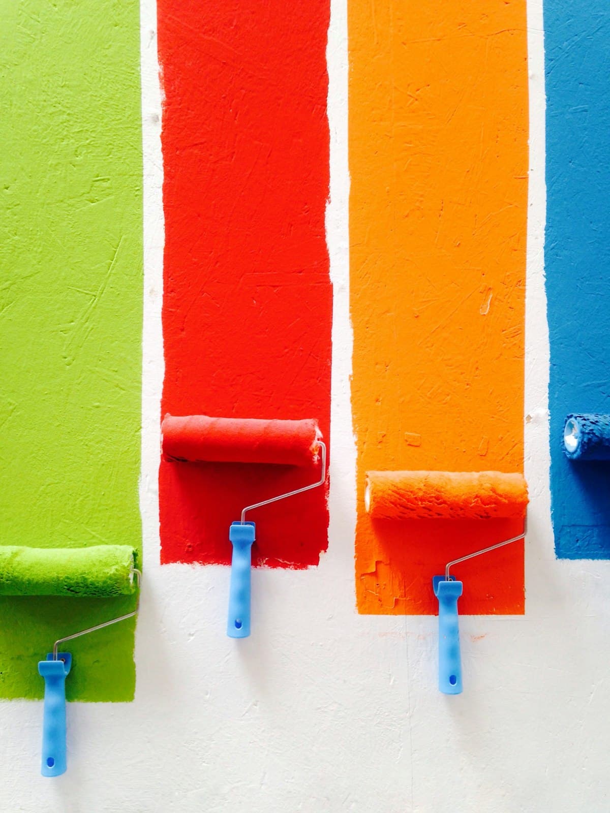
Photo by Russn_fckr on Unsplash
What does each color signal?
Each color carries broad associations, but context decides whether it helps or hurts. The popular advice ("blue means trust, red means urgency") is true as far as it goes, and the nuance underneath it is where strategic design lives. The table below summarizes the practical read on the colors that come up most in web design.
| Color | Signals | Works well for | Watch out for |
|---|---|---|---|
| Blue | Trust, stability, security | Trust signals, finance, healthcare, tech | Overuse reads cold; suppresses appetite, weak for food |
| Red | Urgency, energy, attention | Genuine limited-time offers, sale tags, CTAs | Whole-page red feels aggressive; false urgency backfires |
| Green | Growth, money, permission | Checkout buttons, success states, health and finance | Can feel generic if overused as a default accent |
| Orange | Enthusiasm without anxiety | CTAs, accessible and youthful brands | Can feel cheap in luxury contexts |
| Black | Luxury, authority, exclusivity | Premium positioning, high-end services | Heavy and hard to read without space and good typography |
| White | Clarity, breathing room | Hierarchy, premium feel, focus | Treated as wasted space by amateurs; needs deliberate use |
Blue is the most common color in web design because it reads as stable and professional, which is why banks and tech companies lean on it. Its cost is coldness: too much blue feels impersonal, so it works best in trust signals balanced by warmer elements. Red drives action through urgency but demands restraint, a single red button on a cool page draws the eye, while an all-red page exhausts. Green is unusually versatile, carrying associations with growth, money, and the universal "go," which makes it strong for checkout and success states. Orange splits the difference, energetic without the anxiety of red, which is why many treat it as a default CTA color. Black signals premium positioning when used with care, and white is an active design tool, not empty space, giving everything else room to breathe.
What is the best color for a call-to-action button?
There is no universally best CTA color; the button that wins is almost always the one that contrasts most with the page around it. A widely cited A/B test once showed a red button beating a green one, and other tests have shown the reverse. The contradiction resolves on contrast: on a green-heavy page a red button stands out, and on a red-heavy page green does. Isolation matters more than the specific hue.
The practical lesson is to ignore someone else's winning color and look at your own page. Pick the CTA color that creates the strongest contrast against your dominant palette, then confirm it with a test rather than assuming. Borrowed button colors are a common reason a "best practice" fails to reproduce.
Photo by Edho Pratama on Unsplash
How should colors be combined?
Colors are best combined with intention, because the relationship between your primary, secondary, and accent colors creates an emotional read that no single color achieves alone. Two relationships do most of the work. Complementary colors, opposite on the color wheel like blue and orange, create maximum contrast and grab attention, which is ideal for a CTA but exhausting if used everywhere. Analogous colors, adjacent on the wheel like blue, blue-green, and green, feel harmonious and easy on the eyes, which suits brands that want a calm, professional tone.
A reliable starting structure is the 60-30-10 rule: roughly 60 percent dominant color, 30 percent secondary, and 10 percent accent. The dominant color fills backgrounds and large areas, the secondary supports it, and the accent, usually your most vivid choice, goes on the elements you want noticed first, like calls to action. This keeps a page balanced while preserving a clear hierarchy.
Why should color choices be tested?
Color choices should be tested because the same change can raise conversions for one audience and lower them for another, depending on context. Theory points you in a sensible direction; it does not predict your specific visitors. A button color or a palette tweak that worked for another business may do nothing, or the opposite, for yours.
Run A/B tests on high-impact elements first, like your primary CTA, before committing to a broader palette overhaul. Some patterns hold reliably: trust elements such as security badges and testimonials tend to read better in cool blues and greens, while warm colors suit action elements. But the safe path is always to validate a change against your own audience rather than rolling it out on faith. Color is also one of your main tools for the visual hierarchy that prevents common UX mistakes.
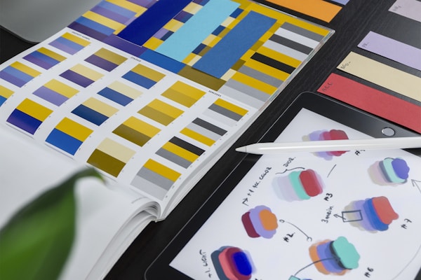
Photo by Tran Mau Tri Tam on Unsplash
Do color meanings change across cultures?
Yes, color meanings vary significantly across cultures, so a palette that converts in one market can confuse or offend in another. White signals purity and weddings in Western contexts but mourning in much of Asia. Red means danger in the West but luck and prosperity in China. Green carries religious connotations in much of the Middle East. None of this is trivia; it changes how a real audience reads your page.
This matters directly for Philippine businesses. Filipino audiences often blend Western and Asian color associations, and red in particular reads positively here, tied to celebration, good fortune, and energy, more than as a pure warning signal. If your audience spans local and international markets, or different regions within them, research color associations per market rather than assuming the Western defaults apply everywhere.
How do you apply strategic color to your own site?
Applying strategic color starts with an honest audit, then disciplined consistency. Look at your current palette with fresh eyes and ask what it makes a visitor feel, whether that matches your intent, and whether your CTA contrasts enough to be noticed. Most underperforming sites fail on hierarchy, and color is a primary tool for fixing it.
From there, change deliberately and keep your meanings consistent. Once green means success on your site, it should mean success everywhere; once orange signals a clickable action, do not use it for decoration. Consistency teaches visitors your visual language without conscious effort, which makes navigation and conversion paths feel intuitive. Most competitors choose colors by preference and leave that advantage on the table.
Color is one of the quiet levers that decides how a site performs. If you want a palette built on strategy and tested against your real audience rather than guesswork, book a call and we will look at where your current design is helping you and where it is holding you back.
Related service
Web design services in the PhilippinesFrequently asked questions
Why does color matter in web design?
The article says visitors process color before reading text, and color can shape subconscious judgments about trust, brand perception, and whether they stay or leave.
What is the best color for a call-to-action button?
There is no universal best color. The article says the winning button is usually the one that contrasts most with the surrounding page.
When should a website use blue?
Blue works well for trust signals such as security badges, testimonials, and pricing sections. The article warns that too much blue can feel cold or impersonal.
Why should color choices be tested?
The article says the same color change can raise or lower conversions depending on the audience and page context, so A/B testing is needed before committing.
Do color meanings change across cultures?
Yes. The article notes that white, red, and green can carry different meanings across cultures, so international audiences require market-specific color research.
Traffic but
no conversions?
We design sites that turn visitors into customers. Let's talk about yours.
Get in touchPillar guideDevelopment · Feb 17
What Makes a Good Homepage: The 9 Elements That Actually Convert Visitors
Resources · Apr 28
How to Write Website Copy That Converts: A Framework for Every Page
Development · Apr 7
Microinteractions in Web Design: When Small Animations Make a Big UX Difference
Business · Mar 29