Development · 7 min read
Mobile-First Design: Why Google Cares More About Your Phone Experience Than Desktop
Google judges your site mainly by how it works on a phone. Here is what mobile-first means, the UX problems that hurt rankings, and how to test and fix yours.
Share

Key takeaways
- Google primarily uses your mobile site to determine rankings, so a weak phone experience can hurt search visibility.
- Mobile-first design starts with the smallest screen, then adds features and space for tablets and desktops.
- Slow load times, tiny text, intrusive popups, broken navigation, and horizontal scrolling can damage mobile UX.
- Testing on real phones and tools like PageSpeed Insights helps reveal mobile performance and usability issues.
- Better mobile design can reduce bounce rates, improve conversions, and help protect search visibility.
Google now judges your website mainly by how it works on a phone, not a desktop. If your site is faster, clearer, and easier to use on mobile, you rank better. This is not a trend or a suggestion; it is how Google's index works in 2026. Yet plenty of business websites are still built desktop-first and "made responsive" for mobile as an afterthought, and that ordering quietly costs them rankings and customers.
For Philippine businesses this matters even more, because most of your visitors are almost certainly on phones. Understanding mobile-first design, and why Google leans on it so heavily, is no longer optional for anyone running a website here.
What is mobile-first indexing?
Mobile-first indexing means Google primarily uses the mobile version of your website to determine your rankings. Google made this shift several years ago, and the practical effect is blunt: if your mobile site is slow, broken, or poorly designed, your rankings suffer, and your desktop version barely factors in.
That is a reversal of how the web was built for a decade. The old habit was to design the full desktop experience first, then shrink it for phones. Now the order is flipped, and the mobile experience is the one Google actually reads. Most web traffic in the Philippines comes from mobile, mobile search overtook desktop globally years ago, and Google's algorithm simply reflects where people already are. If your site does not perform on phones, you lose ground.
How is mobile-first design different from responsive design?
Responsive design resizes a site to fit different screens; mobile-first design starts from the smallest screen and builds up. They are related but not the same, and the difference is the order of decisions. Almost every modern site is responsive. Far fewer are genuinely mobile-first.
| Approach | How it is built | Result |
|---|---|---|
| Desktop-first (outdated) | Design a full desktop layout, then strip features to fit a phone | Mobile feels like a cut-down version of the "real" site |
| Mobile-first (modern) | Design for a 375px phone first, then add space and features for larger screens | Mobile is optimized; desktop is the enhancement |
Mobile-first forces prioritization. On a phone you cannot show everything, so you show what matters most: the headline, the key information, the call to action. Done right, that discipline makes the experience better for everyone. The page loads faster, navigation is clearer, the message is simpler, and desktop users get that clean foundation plus the extras. Our guide on common UX mistakes that quietly kill conversions covers where this often goes wrong.
What mobile UX problems hurt rankings?
The mobile problems that hurt rankings most are slow performance, unreadable text and tiny tap targets, intrusive popups, broken navigation, horizontal scrolling, and crowded forms. Google's algorithm reads these as signs of a poor experience.
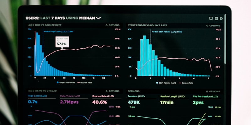
Slow performance is the biggest one. Mobile networks are slower than broadband, so an unoptimized image that loads instantly on desktop can take several seconds on a phone. Google's Core Web Vitals specifically measure mobile, and if your Largest Contentful Paint (the time until the main content appears) exceeds 2.5 seconds on mobile, your rankings take the hit. Text smaller than about 16px and tap targets smaller than roughly 48 by 48 pixels force people to pinch and zoom, which Google flags as a usability problem.
The rest compound the damage. Popups that cover the whole 375px screen are penalized as intrusive interstitials. A hamburger menu that is hard to tap or does not open properly leaves visitors lost, so they bounce and your bounce rate climbs. Content that forces left-to-right scrolling, usually from oversized images, non-responsive tables, or fixed-width containers, reads as broken. And forms crammed with fields get abandoned faster on a small screen than anywhere else, which drags conversions down directly.
How should you test your website on mobile?
You should test on a real phone first, then use Google's tools to confirm. Assuming your site "works on mobile" because it resizes is the most common mistake; actually using it on a phone is where the problems surface.
For a quick check, open your site on an actual phone rather than a zoomed-out desktop browser. Try tapping every button and link without zooming, read a full page without zooming, and time how long it takes to load on mobile data rather than wifi. Anything that feels awkward, slow, or fiddly is a real problem your visitors are hitting too.
For a thorough check, lean on tools. Google PageSpeed Insights gives you a mobile score and a specific list of issues; aim for a strong score and treat the recommendations as a to-do list. Google's Mobile-Friendly Test catches the obvious failures. Chrome DevTools lets you emulate different screen sizes and throttle the network to simulate a slow connection. None of this replaces testing on actual devices, though, since real phones surface issues emulators miss, so try it on a few different handsets if you can.
What are the most common mobile design mistakes?
The most common mistakes are desktop-first thinking, unoptimized images, relying on hover, and ignoring mobile form design. Each has a straightforward fix.
Desktop-first thinking is the root issue, and the fix is to make every layout decision for a 375px screen first, then enhance upward. Heavy images are the next worst offender; compress them, use modern formats like WebP, and lazy-load anything below the fold so it only downloads when the visitor scrolls to it. Our guide on image optimization covers exactly how.
Hover is a desktop-only interaction. Any menu or control that only appears on hover is unreachable by touch, so test every interactive element on a phone and make sure a tap works everywhere. Forms need the same care: ask for fewer fields, use mobile-appropriate inputs like a number keyboard for phone numbers and a date picker for dates, and enable autocomplete so people are not typing more than they have to. For why all of this connects to inclusion as well as conversions, see why accessibility is a business priority, not optional.
Why does mobile-first design matter for your business?
Beyond rankings, mobile-first design matters because poor mobile UX leaks customers at every stage. A slow or awkward phone experience raises your bounce rate, so visitors leave before they engage. It lowers conversions, because a clunky form or confusing navigation kills intent even among people who stay. It drags down search visibility as Google penalizes weak mobile performance, which compounds into less traffic over time. And it hands customers to competitors who got their mobile experience right.
The investment to fix it is modest against that cost. In the Philippines, a professional marketing site typically runs ₱50,000 to ₱150,000 (roughly $900 to $2,700), with custom marketing builds reaching ₱150,000 to ₱350,000 (about $2,700 to $6,300); our web design cost guide for the Philippines breaks down what drives the range. A site built mobile-first from the start avoids the rebuilds that catch up with desktop-first sites later.
The takeaway is simple. In 2026, mobile-first is the baseline, not an upgrade. Spend twenty minutes this week using your own site on a phone, fix the obvious problems, and plan a proper redesign if the whole thing fights you. If you would rather have it built right the first time, book a call and we will start with the phone, the way Google does.
Related service
Web design services in the PhilippinesFrequently asked questions
What is mobile-first indexing?
Mobile-first indexing means Google primarily uses the mobile version of your website to determine rankings. If the mobile site is slow, broken, or poorly designed, the article says your rankings can suffer.
How is mobile-first design different from responsive design?
Responsive design resizes a site for different screens. Mobile-first design starts with the smallest screen first, prioritizes essential content and touch interactions, then enhances the experience for larger screens.
What mobile UX problems can hurt rankings?
The article lists slow mobile performance, unreadable text, tiny tap targets, intrusive popups, broken mobile navigation, horizontal scrolling, and crowded forms as common problems that hurt mobile UX.
How should I test my website on mobile?
Open the site on an actual phone, tap links without zooming, read pages without zooming, test keyboard navigation, and check load time on a slow mobile network. The article also recommends PageSpeed Insights, Mobile-Friendly Test, Chrome DevTools, and real device testing.
Why does mobile-first design matter for business?
The article says poor mobile UX can increase bounce rates, reduce conversions, lower search visibility, and cost you customers to competitors with better mobile experiences.
Invisible
on Google?
We build sites that actually get found. Let's talk about your search visibility.
Get in touchPillar guideResources · Jan 26
The Only SEO Checklist You Will Ever Need (2026 Edition)
Resources · Apr 6
Google Algorithm Updates in 2026: What Changed and How It Affects Your Website Rankings
Resources · Mar 16
How to Migrate Your Website to a New Domain Without Losing SEO Rankings
Business · Feb 23